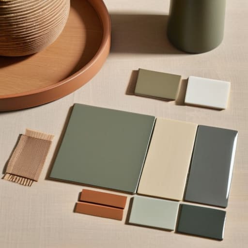

I was sitting on the floor of my guest room last Tuesday, surrounded by fifty different shades of “eggshell” paint swatches, feeling like I was losing my mind. It’s that classic, overwhelming trap: you go into the store for one simple thing, and suddenly you’re spiraling because a professional designer told you that you need to understand the psychological nuances of undertones just to pick a living room hue. Honestly, the idea that you need a degree in color theory to figure out how to choose a color scheme is complete nonsense. We aren’t designing museums; we’re just trying to make our homes feel actually livable without spending three weeks staring at a wall.
I’m not here to sell you on expensive color consultations or complicated mathematical formulas that nobody has time for. Instead, I want to give you a straightforward, practical way to look at your space so you can make a decision and move on with your life. I’m going to share the same simple logic I use when I’m restoring a vintage sideboard or tackling a room refresh: pick what works for your light, keep it functional, and stop overthinking it. Let’s get your colors sorted so you can get back to actually enjoying your home.
Color Theory for Beginners the Only Basics You Actually Need
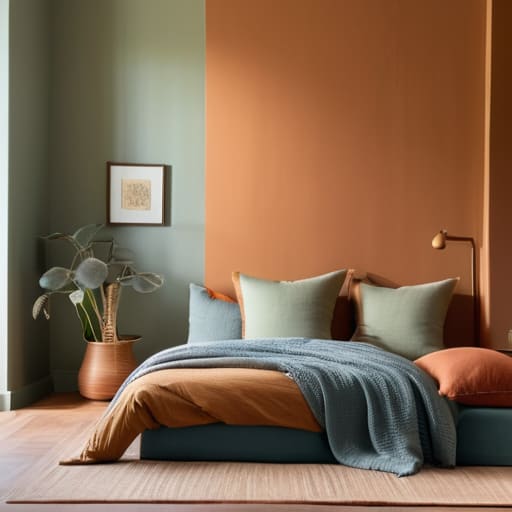
Look, I know “color theory” sounds like something you’d only hear in a stuffy design studio, but it’s actually much simpler than the textbooks make it out to be. You don’t need to memorize a giant wheel to get this right; you just need to understand how colors interact. For starters, think about warm vs cool color tones. Warm tones—think terracottas and soft yellows—tend to make a room feel cozy and inviting, which is great for a living room. Cool tones, like blues or sage greens, are much better for calming down a bedroom.
If you’re feeling a bit paralyzed by too many options, my go-to trick is sticking to monochromatic color palettes. This basically means picking one color and using different shades and tints of it throughout the space. It’s a foolproof way to create a cohesive look without the headache of matching a dozen different hues. If you want a bit more energy, you can experiment with complementary color combinations—pairing opposites like blue and orange—but just keep it subtle so your eyes don’t get tired.
Warm vs Cool Color Tones Finding Your Homes Real Vibe
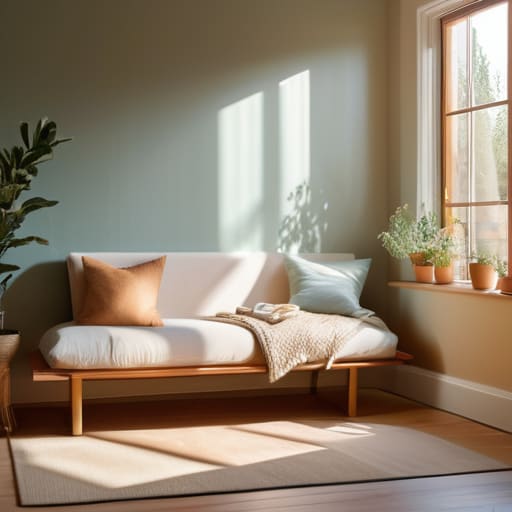
Once you’ve got the basics down, the next step is deciding on the “temperature” of your space. This is where most people get stuck, but it’s actually pretty intuitive if you stop looking at swatches and start thinking about how you want to feel when you walk through the door. Warm vs cool color tones are the biggest drivers of a room’s mood. Warm tones—think terracotta, soft ochre, or creamy whites—tend to make a room feel cozy and inviting, which is perfect for a living area where you want to kick back.
On the flip side, cool tones like sage greens, dusty blues, or slate greys bring a sense of calm and order. I personally love using these in home offices or bedrooms because they help quiet the mental noise. The trick isn’t to pick one and stick to it religiously, but to use interior design color psychology to balance the two. You don’t want a living room that feels like a sterile hospital, but you also don’t want a bedroom that feels like a literal campfire. It’s all about finding that sweet spot where the temperature matches your lifestyle.
5 Ways to Get It Right Without the Headache
- Start with your “anchor” piece. Instead of staring at a blank wall, look at that rug you love or the vintage armchair you just refinished. Use those existing colors as your foundation so you aren’t fighting against things you already own.
- Follow the 60-30-10 rule to keep things balanced. Aim for 60% of a dominant color (usually your walls), 30% of a secondary color (furniture or upholstery), and 10% for an accent color (pillows or decor). It stops the room from feeling cluttered or lopsided.
- Don’t forget to test your samples in your actual light. A gray that looks sophisticated in the store might look like a depressing slab of concrete in your dimly lit living room. Paint a small patch and watch how it shifts from morning to night.
- Use “bridge colors” to connect different spaces. If your living room is navy and your hallway is beige, find a pattern or a small decor piece that features both. It makes the transition between rooms feel intentional rather than accidental.
- Limit your palette to keep things calm. You don’t need a rainbow in every room. Picking three or four closely related shades keeps the space feeling cohesive and prevents that “visual noise” that makes a home feel stressful.
## My Golden Rule for Color
“Stop trying to design a museum and start designing a home. You don’t need a perfect, mathematically balanced palette; you just need a few colors that make you feel calm enough to actually sit down and breathe when you walk through the door.”
Elena Vance
Stop Overthinking and Start Painting
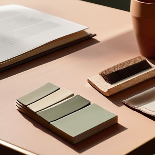
At the end of the day, picking a color scheme doesn’t have to be this massive, daunting project that keeps you up at night. We’ve covered the basics—from understanding how colors interact to deciding whether you want a cozy, warm atmosphere or a crisp, cool one. Remember, you don’t need to master the entire color wheel to make a room feel cohesive; you just need to pick a few shades that actually speak to you and ensure they play nice together. Whether you’re leaning into a bold accent wall or sticking to a safe, minimalist palette, the goal is to create a space that feels intentional rather than accidental. Just keep it practical and functional, and don’t let the fear of making a “wrong” choice paralyze you.
I know how easy it is to get lost in the endless rows of paint swatches at the hardware store, but please, don’t let the pursuit of perfection steal your peace. Your home is meant to be lived in, not curated like a sterile museum exhibit. If you pick a color and realize two weeks later that it’s not quite right, it’s not the end of the world—it’s just a learning experience. The most important thing is that your space reflects who you are and makes you feel grounded when you walk through the door. So, grab a sample, test it out in your own light, and just go for it. You’ve got this.


I believe that a well-run home shouldn't require a PhD or a massive budget. My goal is to strip away the complexity so you can focus on actually living in your space. Let's keep things practical, efficient, and genuinely useful.
View All Articles